


Bucking Bronco
It has been a while since I posted something here. The month has been crazy getting ready for the holidays and my son's first birthday party. I haven't done much painting this month. I did however finish this painting that I posted the underpainting of at the end of November. This painting ended up being a struggle and I scraped the paint off a couple of times. It was a real lerning experience and I gained some good knowledge from this one. Not completely satisfied with the outcome, but there are a lot of elements that I do like about this painting. This was done for my nephew as a Xmas gift. I built tha frame myself and was very happy with the way the frame turned out.
Oil on 12 x 14 panel.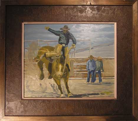
12.27.2006
11.29.2006
A Reminder of the Past
Last Friday I went to visit my parents for the afternoon. I painted this in the backyard. This painting is of Pete's farm which bordered the property line of my parents. Growing up I spent a lot of time up at the farm. Going out with Pete to gather hay bails, building forts in the hay loft, messing with the cows, running from angry bulls, riding bikes through the pasture, drinking cool water from the spring on hot days. That farm and the woods bordering it where a big part of my childhood. Even though I lived in a small apartment with two other brothers in one room, having permission to hang out at the farm made me feel like I grew up in my own personal estate. Unfortunatly progress marches on, and the farm was sold a few years ago to a developer. They have already begun to build large homes on the property. I hope to get back and paint what is left of the pastures before they are all gone.
11.26.2006
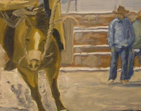
This is what is on my easel currently. This is a painting for my nephew who loves rodeos. Especially the bucking bronco.
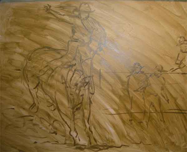
This is the underpainting which is a wash of oil on a 12x14 panel. I am pretty happy with the positioning of the elements but worry that the lack of connection from the bronco to the figures on the right breaks up the composition. I will probably drop the figure sitting on the fence being that he is so close to edge that a frame will cover part of him. Also I don't think it really adds anything to the composition and if anything is distracting.
11.18.2006
I am pretty happy with the way this painting turned out. Painting is about creating an illusion of depth, light and form on a flat surface. As a painter I am creating shapes and color using brushstrokes to acheive that illusion. I feel, I have made a succesful painting when I buy into my own illusion. I still see a lot of "painting" mistakes, but for the most part I just see the subject as it is presented in it's enviroment. This was paintedfor my Nephew Logan as a christmas gift. He is big into John Deere tractors right now. I am also doing a bucking bronco for his brother Collin, who is big into rodeo stuff now. 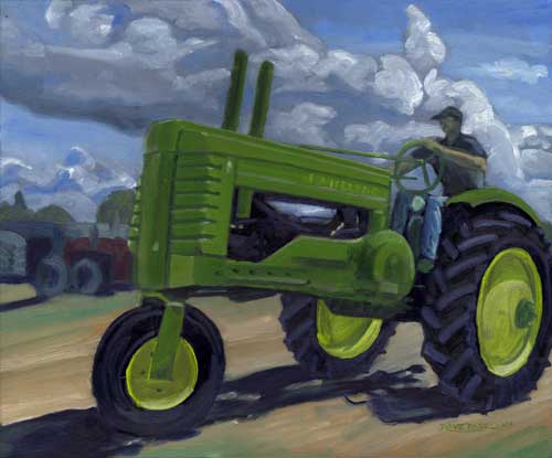
"John Deere" 12 x 14 Oil on panel
This is a snapshot of the black and white underpainting.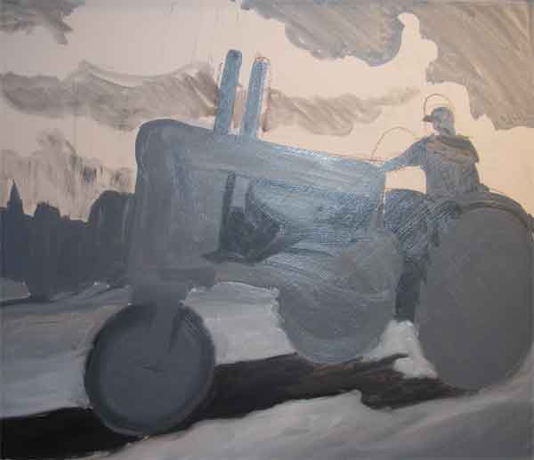
Paintin...
Paintin...
I Did this a couple of weeks ago. I wanted to play around with an industrial theme and I came across a photo of a welder that had some great light in it. Most of the painting was done in one sitting. After I let it dry I came back and added in the sparks coming off the welding torch.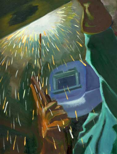
"Welder" 10 x 12, Oil on panel
11.10.2006
Painting...
Finally got a chance to scan the paintings Ive done for the "Essence of Pittsburgh" plain air worksop I am taking. I can feel myself getting better and better each time I complete a painting. Some of Ron's techniques I struggle with, but I am taking some of what I am learning with Ron and what I already know and sort of mixing up my own technique. That style doesn't appear in these painting, as I am trying to stay true to Ron's technique for the learning value of it. I have a new painting on the easle that is definitly more my style.
This tree was from the first class. I only spent about an hour and a half on this. I really struggled with the color as this was the first time I ever used a limited palette.
8x10 Oil on panel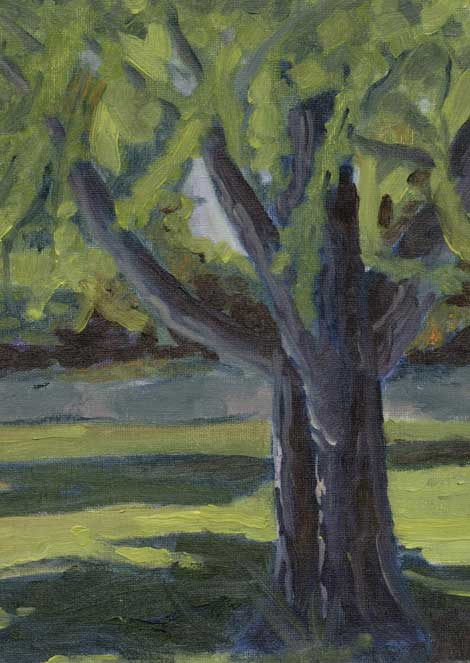
This ally scene is from the second class. Unfortunatly it was pouring down rain that day and we weren't able to get outside. Instead Ron brought a painting in that he had completed earlier and we followed along as he walked us through his process. I was situated under bad light and wasn't able to see the details of his painting. So most of it is plain and most of the detials are made up. After his demo I went up to take a closer look at the paintin and realized that I got it all wrong. But, all in all it was a great lesson.
8x10 Oil on Panel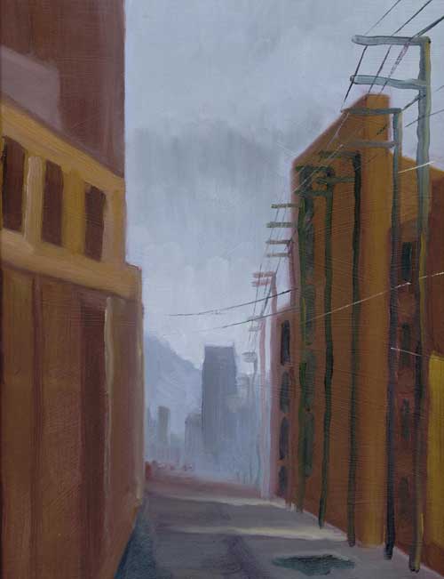
This painting, from the third class was outside in Polish Hill. This was lookiing across a three way intersection towards a bar at the crest of a hill. I dont like the color much. I was too focused on the color and forgot to place importance on the value of the light. The whole painting looks rather flat.
8x10 Oil on Panel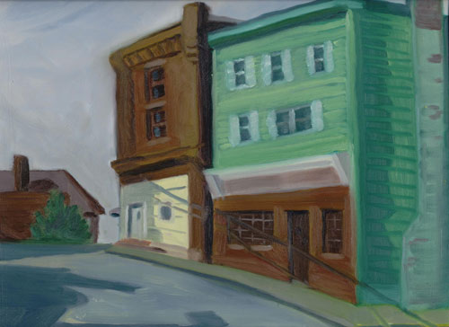
10.25.2006
Plein Air Paintin...
I joined the PAPWP group on Sunday the 8th at Phipps Conservatory. It ended up being a beautiful day and the gardens were a great place to paint. This painting is from the side gardens looking out across Panther Hollow to the Cathedral of Learning at the University of Pittsburgh. 10 x 12 Oil on panel.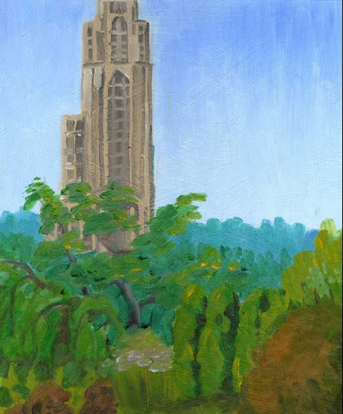
This one was a quick grab of some purple flowers that were to my right. I don't recall the name of the flowers(I need to start carrying a notebook to jot down notes),but I had just finished with the Cahtedral painting and a nice beam of sunlight was shining on these purple flowers and the scene was so dramatic. So I moved my easel and started to paint them. Unfortunatly as quickly as the sun hit the flowers, it just as quickly went away. Iwas in a bad position as the sun was behind filtering through a tree. So everything would either be in complete shadow or direct sunlight, depending on how the tree branches moved. So I only spent about fifteen minutes on this. Quick and dirty. 10 x 12 Oil on panel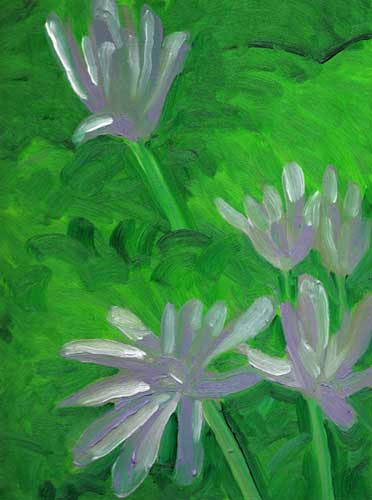
Paintin...
This is a "plein air" painting I did in the studio(if you can do such a thing). I painted this from a photograph I pulled up on my computer. Even though this is inside, I approached it as if I was painting outside. I spent about two hours on this.
Mostly brush work with some knive painting to ge the crest of the waves and the pier. I also used the knife to create the shadows coming across the beach from the right. I like working with the knife but it is definitly going to take practice to get used to it.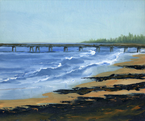
10.24.2006
Sketchin...
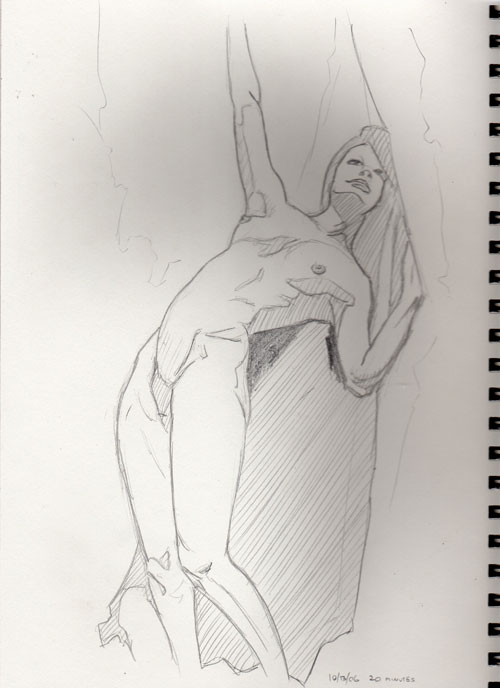
I have been wanting to do some figure studies for a while now. Just doing the plein air painting is keeping my hands full, but I managed to squeeze this one out in a couple of sittings. I came across this photo from a California photographer. I would love to paint some figures from his work. He has a great sense of dramatic lighting that really highlights the body.
The sketch took about 20 minutes to complete. Finishing it in Conte' crayon took about an hour and a half.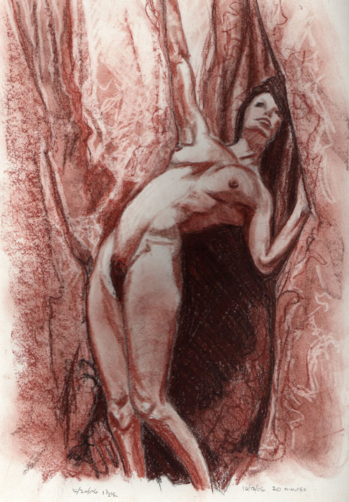
Ramblin...
Phew! Time flys by when you are not looking. Been thirteen days since my last post.
I started the "Essence of Pittsburgh" en plein air workshop this past Saturday.
Was fun and very educational. I think I am going to learn a lot from Ron. The group was small, maybe eight people, which was nice as it kept the one-on-one time more personal. Very nice group of artists and I look forward to painting with them all again next Saturday. First Ron talked about his pallete set up and color choices. We are using a limited pallete of Thalo Green, Ultramarine Blue, Alizarin Crimson, Cadmium Red, Cadmium Orange, Cadmium Yellow Medium, Cadmium Yellow Lemon and Titanium White.
Okay, it doesn't sound so limited, but when I was trying to capture the color of a tree trunk before the sun moved and the color changed, I panicked and struggled. I just wanted to grab a tube of Burnt Sienna and Yellow Ochre. But that is the point of taking this class, to learn something new and paint a little differently than I normally do. I actually like the limited pallete, as it forces me to learn better color mixing skills. I plan to create some color charts this week using that pallete.
After discussing his pallete and basic set up for painting outdoors, Ron did a demonstration and explained some of the difficulty and challanges of painting outdoors. Not only dealing with the elements and people, but mainly how you have to quickly capture the light of the scene before it changes.
After Ron's demo we had about 45 minutes of time left so he let us loose and we took up positions through the grounds of the art center and painted. I will post a photo soon. I have about 3 painting to post, just waiting for an oppurtunity to photograph them.
10.10.2006
Been a while since I last posted, so I thought I should check in. Been hard to find the time to create art. I did get out this past sunday with the plein air group. I completed two paintings, one in hast as I was losing light. I think I improved some in my brush work, but I am still struggling with color mix and temerature.
Saturday we went to the Lawranceville art crawl, which was interesting. Highlight of the walking tour was stopping by Ron Donohue's studio. His work was georgeous in person and i cant wait to start the workshop he is teaching at the Pittsburgh Center for the Arts.
I will post my paintings from Sunday as soon as I get a chance.
10.02.2006
Heres my plein air from Sunday. I am still having trouble getting good pictures, but this will work.
This is the playground across the street from my house. It was an overcast day, but every ten minutes or so the sun would break through and gave me some nice shadows.
I tried to limit my palette to the following colors: Ultramarine Blue, Cadnium Yellow Light, Burnt Umber, Alizarin Crimson, Titanium White and Ivory Black. I am still trying to wrap my brain around color temperature, I understand it, but it tends to get lost on me during the painting process. I will post this on wetcanvas for some advice. I am sure someone will be able to advise me on how to warm up the painting, being that it is mostly cool colors.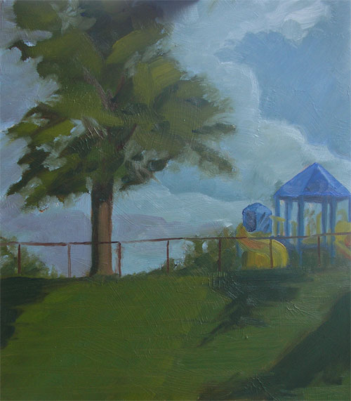
9.27.2006
Paintin...
I wasn't going to post the painting I did on my first plein air outing. But after thinking about I thought what the hell, I will post it. Even though I do not like this painting, the whole point of starting this blog in the first place was to track my progress and progression as an artist. I am actually starting to like this painting. The reason being that I can look at it now and see all of the things that need to be improved, or how I could have done it better. So, I am learning a lot from this painting and, from that outing. There is another plein air outing coming up this Sunday, and being that it is a bi-week for the Steelers (they generally meet at 2:00, an hour into game time), I am planning on attending.
This is oil on 10 x 12 panel. It is a view from Mt. Washington looking down the Monongahela river valley ( Monongahela is a Lenape[Native American] word for "High bluffs", or "falling banks"). The Southside of Pittsburgh is on the right.
I hope to return in a year and paint the same scene to see how much progress I have made.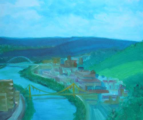
Sketchin...
Haven't done much sketching this past week. I took a look at the image from this weeks drawing thread at wetcanvas. I loved the image so much I decided in stead of sketching it, I would try to paint it. This is oil on a 10 x12 panel. It took about 2 hours or so to complete. My egg shapes are funny, but I think I captured the light pretty good.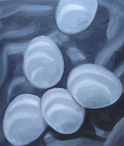
9.19.2006
I added a new playing card painting to my painting blog.
Click here or the link on the right.
I have two more (#4 and #5) complete, just waiting for them to dry so I can scan them and post. I also completed a 10x12 oil that I will post as soon as I am able to either scan, or take a good picture of it.
I have been so consumed with painting that I haven't given any time for sketching. I haven't
had a chance to participate in the drawing forum over at WetCanvas. Bums me out cause I like to keep my drawing skills sharp. In the meantime, I have done a little work on the "etching" project that was discussed on an earlier post. Here is the start of a "logo" that will be used for the "Greatest Materials Moments" event.![]()
9.18.2006
Paintin'...
Well I went out on my first plein air adventure yesterday. I found out about a local group (Plein Air Painters of Western Pennsylvania) that meets every Sunday at various locations. So I thought I would give it a shot and packed up my paints and headed out. I was nervous about attending being that I have no experience painting in plein air, but with much encouragment and support from Kate, I braved it. Glad I did because it was a good experience. Yesterday the location was at the Mt. Washington overlooks. It was nerve racking being that there is a lot of scenery to take in, and being that it was a beautiful day, a lot of people about.
There were 4 members of PAPWP that day. They were very encouraging and greeted me with a warm welcome. Ron was a great guy and I hope to join them as often as I can. I haven't decided if I am going to post my painting from that day, I think it is quite terrible. I will look at it again and see if it strikes me after the fact.
9.12.2006
Plein Air...
Here is my first attempt at a plein air painting. This a view of the campground we where staying at. It is more of a rough sketch than a complete painting. The brushes I was using were horrible(cheap brushes in a canvas roll from Michaels), and I never finished the foreground. Got to start somewhere though.
I think I did a good job of capturing the light, but the color and composition are not so good.
I really need to come up with a better way of taking pictures. Again, sorry for the blurry pict.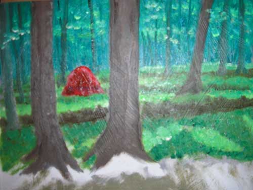
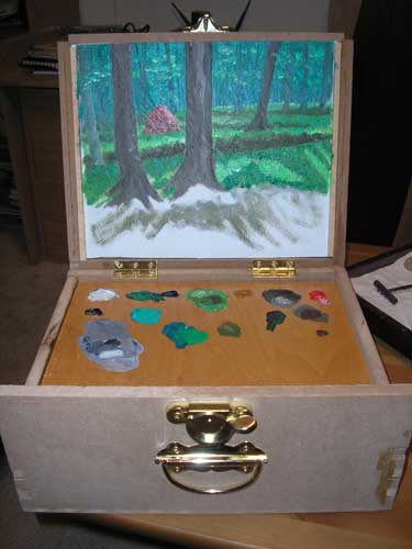
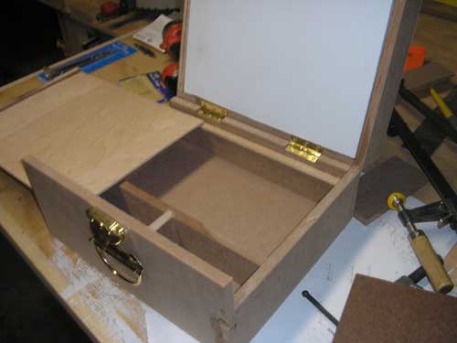
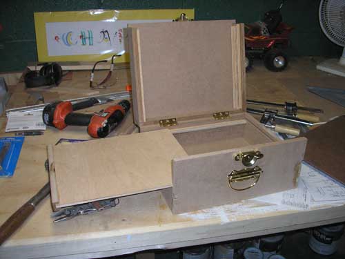
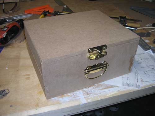
Pochade Box...
Two weekends ago I spent the day building this pochade box. This is a mock up I built using a picture of a Guarilla Box as reference. This one is built using MDF and holds five 10x12 panels. I will build one out of hardwood once I feel that the dimensions and features are to my satisfaction.
It was fun to build, but I doubt that the MDF will hold up over time. I went on a camping trip this past weekend and got to use it. Will post those picts next.
9.03.2006
Still can't seem to get a good picture of the painting I did. So in the meantime here is a shot of my easel with the painting on it. The two smaller painting are on playing cards that have been primed. I use these little cards (3 1/2" x 2 1/2") to use up some of the paint I have left on my pallete and experiment a little. These are the same size as ATC's (Art Trading Cards), although I haven't gotten involved in trading these cards.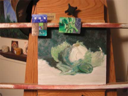
9.01.2006
Ramblin'...
The sample etching went off(postings, 8/28, 8/30). It was well recieved and looks like we are going to proceed forward with the woodcuts renders for the rest of the top ten moments. I will post the progress.
I finally got to do some painting last night. Only got to work for about an hour and a half but it was great. I am working through the Helen Van Wyk book on color mixing. A great guide. I worked the first study on Thalo green using the lettuce and green pepper set up. I am pretty happy with the results. It is a new of approaching oils for me, but I like where it is going. I tried to snap a picture of it last night to post, but the oil was still wet and the reflection was too bad in the pict. Hopefully tonight or tomorrow I will be able to get a good picture of it.
8.30.2006
Painting Sam Continued...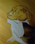
Here I begin to add color to the lighter colored fur of Sam. I believe I used a mix of Titanium White, Blue and Yellow Ochre. I add color to the white of Sam's eye and to the highlight on his nose. These are the lightest areas in the photo and will help me establish my brightest color on the canvas.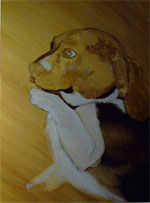
Here I begin to add more dark color, A mix of Burnt Sienne, to the contour of Sam's face. I am slowly beginning to build up some detail on Sam's ear.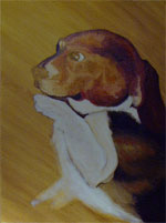
Continuing to build up color and detail in the face, while bouncing back and forth from the ear.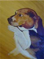
More detail to the face and ear. There is a touch of blue in the darker body color. For some reason my camera picked it up off the wet oil paint when I snapped this shot. Probably because at this point I am really starting to build up some paint on the canvas(compared to the thin layers of the underpainting).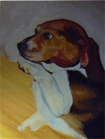
Now that I am happy with the detail of the face and feel that Sam is complete, I start to paint in the background color.
Here is the inked version of the etching sample I needed to create. My brush/ink skills are not very strong. I feel it is a little sloppy. I was hoping that the sloppiness of the ink lines would mimic the "bleed" and line break-up that occurs when prints are pulled from an original wood etching. I am not entirerly convinced that this will work. But it is up to the boss's at work to decide if they like the look. Besides I am usually my worst critic.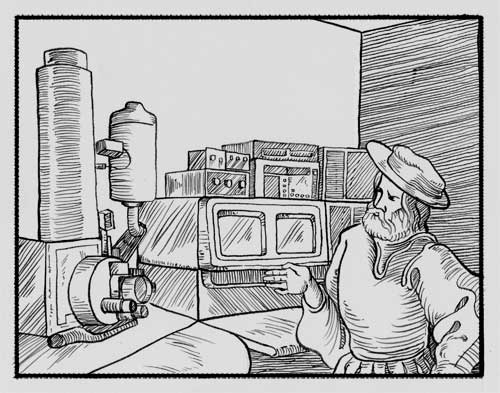
8.29.2006
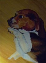
Painting sam...
My brother was checking my blog the other day and was asking about my process for the "Sam" painting I did(posted 8/19). It so happens that I photographed the process as I went along. It has been several years since I painted this so I will do my best relate my thought process as the painting progresses.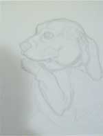
First I sketched out Sam on the canvas board. Its a pretty detailed contour sketch with some marks to indicate highlights and other notable features. (sorry about the photos) looking back on it now, I should have paid better attention to the composition of sketch.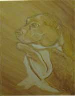
At this point I lay down an oil wash of Yellow Ochre and Burnt Sienna. This will be my body color. I am guessing at the actual tube colors I used being that I did this some time ago. I then took a Q-tip and a rag and began to "pull-out" the highlights to reveal the canvas below. I then took a darker mix and layed in the shadow and darker areas of the body.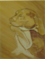
Here I begin to build up my dark areas while defining some detail and highlights. I tend to build up to my dark/light tones, sneeking up on a balance that I like. I do this more out of fear than anything.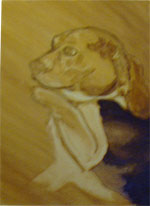
I continue to build up my color and detail. Working the larger areas first.
8.28.2006
If anyone is actually following along out there, you may remember I mentioned creating some illustrations as woodcuts(posted on 8/24/06). The following images are samples of the woodcuts they would like me to recreate.
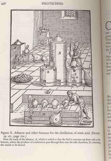
The following image is from a cover of JOM. The monthly magazine that the organization publishes. This image of a electron microscope may not be one of the final acheivements voted on, but this is just for a sample piece to see if the exacution will work well or not.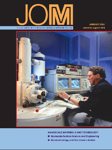
This is my sketch so far. Not only do I need to make it look like a woodcut, but I replaced the person sitting there with a more sixteenth century looking figure. I think it looks good so far. I hope that when I ink it, it will have the look I am aiming for.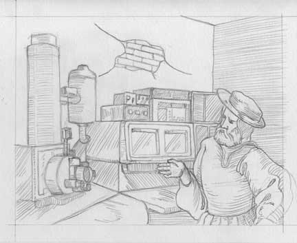
I posted this at wetcanvas to get some input from some fellow artists. you can check that out here
8.27.2006
Sketchin...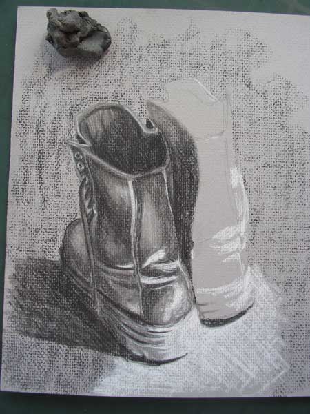

Finally got a change to squeeze a fews of sketching in. This is another challange from the weekly drawing thread at wetcanvas(WDT@WC). I thought this would be a fun one to approach a little differently. I used black and white charcoal on a grey watercolor paper. I think it worked well. The trexture of the paper made it difficult to blend, but it lends to the "feel" of the sketch.
8.24.2006
Rambling...
It has been a busy week and I haven't had a chance to do any drawing. I was approached last week at work about an illustration project. The organization I work for is celebrating it's 50th anniversary (in its current inception). To honor the occasion they will be rolling out a top ten list of the greatest engineering achievements of all time. The idea came about to illustrate these acheivements as woodcut prints, simular to ones created in the sixteenth century. Should be a fun and challenging project to work on. I did some experimenting with different ways of executing a rendering that would mimick this look. I think I will use a #2 fine brush and black ink on Bristol board to acheive the effect. Will post the progress
I am getting ready to start doing some painting. I have been looking at different artists and techniques. I think I am really going to love plein aire painting. I love the loose style and painterly brushwork of this style of painting. Soon I will begin my color theory training, I could get away with just jumping in and painting, I have done well in the past simple using my instincts to guide me through a painting when it comes to color. I feel, however, that it is time to start learning the ins and outs of color so that I can better acheive the look and feel of a subject that I may be looking for.
I found this great instructional link on wetcanvas for preparing your own panels using masonite(hardboard). I am going to do that this weekend. I figured I could get 36 10x12 panels and 4 6x12 panels from a 4'x8' sheet. Cant wait to get this done so I can start working through my color theory book and begin putting some paint to canvas (or board as the case may be).
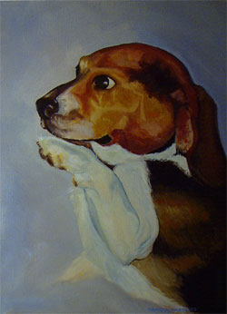
8.19.2006
Sam, Oil on canvas board, 12" x 18"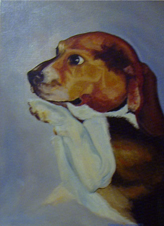
This was a commision I did for a former co-worker. Sam was her true friend and when he passed she wanted something to remember him by. This was only the third time I painted in oil. This painting is when I really started to like oil's and saw the potential for me to work in this medium. In, fact I took the money from this commision, went out and bought a bunch of oil paints, new brushes, mediums and the like. Unfortunatly, I not yet painting anything in oil and in fact this was the last painting I have done. That was over four or five years ago. That will change soon though.
8.16.2006
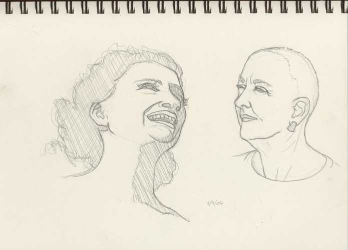
Sketchin'...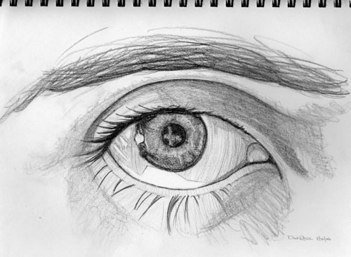
Finished my eye sketch. Ended up filling a whole page in my sketch book with this. It was hard to know when to stop working on this. I could just keep layering and layering the graphite on this but figured it was best to leave it be. Truth is the eye kept staring back at me while I was working on it and it is giving me the creeps. I swear I saw it blink once or twice. :-)
I forgot to keep track of the time I spent. I guess about three hours.
8.15.2006
Sketchin'...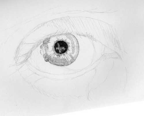
Got another challenge from the weekly drawing thread at wetcanvas. This time it's an eye. This is my progress so far. I spent about an hour, of and on, working in this last night. When I am drawing or painting, I get completely lost in time. I need to make a point of keeping an eye on the time when I am doing any drawing. It will make it easier for me to set aside time in the day to work on some art projects.
8.14.2006
Being that I don't have anything new to post and haven't done any sketching, I figured I would present another painting from the past...
Old Paintings...
Untitled (Leopard), Watercolor, 1997
I painted this leopard for a fundraising auction to help local women's shelters.
It is probably one of my favorite pieces that I have done. Which always seems to be the way with the ones you let go.
This is a watercolor on colored paper. I just love the mood of this painting. I wish I still had it. But it was for a good cause.
8.11.2006
Rambling...
I was reading an article in "Artist's Magazine" about Mark Makers, or artists from the renaissance era and their drawing and sketching skills. Referring to sketching or drawing as making marks on paper (or other substrates) is interesting. When you draw you are so focused on the creation of detail or tone that you sometimes forget what is simply going on. You are making marks.
It truly is a miraculous thing. Creating something from nothing. A blank piece of paper becomes a deep forest or a crowded city street. Art seems to be truth. Its consciousness. I think of the first primitive man who picked up a piece of burned wood and scraped it across a stone. His eyes wide with wonder at the mark it left behind. He had made a discovery, he had created something. That primitive creature could have used that stone for possesive purposes. He may have placed it on a pile of fruits and piece of meat to make it known to others that it is his alone. He may have fought to defend his possesion of food which was now marked. He could have become greedy. Or he could have taken the rock which he marked and used it as a gift. Giving it to another to show compassion or love.
Primitive art could have been the catalyst towards evolution and modern man. It could have been the trigger that invoked consciousness. It could have been the apple Eve gave to Adam. The tree of knowledge gave Adam the ability to see as an artist. To see the world apart from himself through color and contrast. Art gives us the ability to see ourselves.
In almost all ancient cultures the "Shaman" or holy man was also an artist. You have to wonder what came first the artist or the shaman. He had the ability to create images that represented the world around him. That ability gave him power and magical traits. The ability to make representative marks in clay tablets gave the scholars of Egypt power and the pharaoh supreme rule.
Marks where the beginning of alphabets and written language, of architecture and organized society.
Of course, non of the above could be true at all. Just the rambling of an artist's mind.
Old Paintings...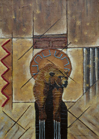
"Bear Totem", Acrylic and Sand, 1997
Even though I painted this over ten years, which is hard to believe, I wanted to start showing some of the work I've done in the past. I haven't done a painting in at least 4 or 5 years. Which is what this blog is actually all about. I have been itchin to paint again but feel like I've lost a lot of the foundation required to paint. So I decided to go back to basics and build my skills from the ground up. As a self taught artist this is something I have never done in the first place. So I am going to keep sketching and sketching and soon will start to put down some color on canvas. Until then I will pull out some older stuff to show every now and again.
The idea behind this painting is to acknowledge native lore and spirituality. It is not only about the bear, which is a sacred animal representing the "dream lodge" or a place of introspection (most artists spend a lot of time in the dream lodge). It also is a nod to the totem pole. The core of the painting represents the totem.
Subscribe to:
Posts (Atom)